We’re officially two weeks into the bathroom renovation so I thought it was a good time to reveal the design and plans. I’ll pop a progress post up soon, a lot has happened in the last couple of weeks.
It took a really long time to lock down these plans. The structural limitations of what we could and couldn’t do were making it difficult to settle on a layout we could live with, and also, it took me a long time to find tiles that I liked that were somewhat in our budget.
I don’t really want to go into cost too much because it pains me that this project will be quite an expensive exercise. Most of the money is going into structural work, and moving major plumbing around. Our house is solid double brick, so there is no running pipes or cables through walls, it’s all chasing out channels through brick and rendering the walls back up again to smooth them over. We also need to move our main sewer stack, so it feels like $$$ is literally going down the toilet. LoL.
The finishes, sanitary ware and taps are probably the least expensive part of the renovation, and to save some money in the budget I had to make a few compromises on design finishes. Initially I selected a gunmetal finish on the tapware, but a change to chrome and a couple of clever substitutions saved $8000, WHAT! Even so, I think it will all come together ok.
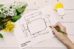
You’ve seen the before photos, but here’s a rough plan of the old layout to get an idea of what we were working with.
Bathroom Plans – Before
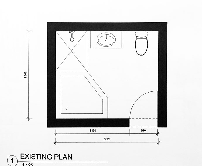
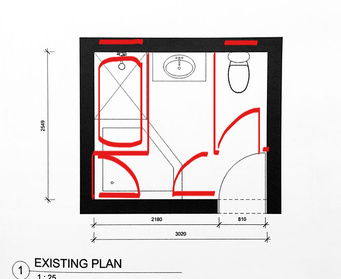
As you can see, the toilet was front and centre as you walked in – it drove me insane. My suspicions, that it was once a separate toilet, were confirmed when the flooring was removed. Turns out the old layout was quite different, with a shower over bath, and a second door through to my bedroom. I had no idea a door was once there, as a built-in wardrobe is covering it on the bedroom side.
Historical Bathroom Layout
You’ll notice that all of the plumbed fixtures face the external wall. That’s because the concrete slab that is the floor of our bathroom, is also the ceiling downstairs, so no plumbing in the floor is possible.
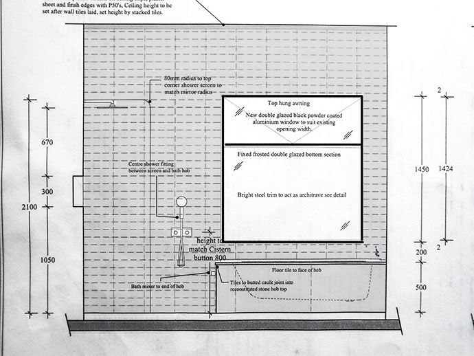
This was a particular challenge when it came to the new layout. Any design that gave us a good use of the space was impossible to plumb, it made our job really hard. I also wanted a freestanding bath, but there was not enough clearance for a drain, so it had to be a built in bath, or no bath at all. The new shower drain trap will go outside the building.
The bathroom designer came up with a workable plan, a compromise on space (the new bathroom will feel smaller than the old one), but we get a walk in shower, double sinks and a bigger window.
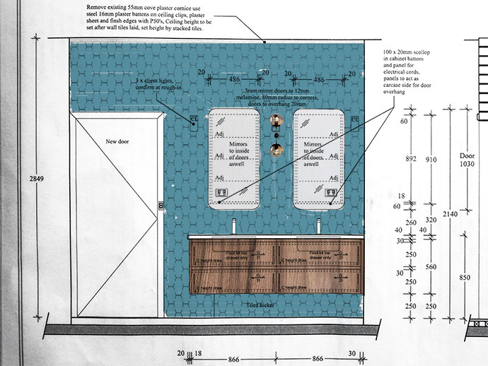
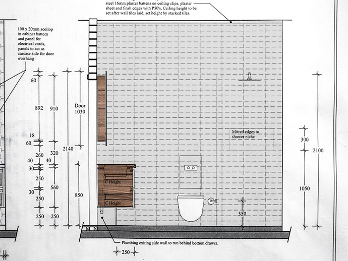
Here’s the new layout, use the door position to orient yourself:
Bathroom Plans – New
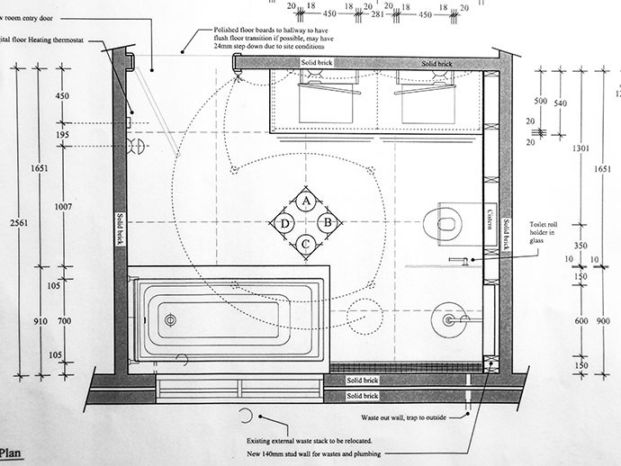
Major Changes:
- New false wall to accommodate plumbing and a shower shelf
- Larger window
- Double vanity with mirrored shaving cabinets
- Sewer stack removed and re-positioned
- New Ceiling
- All new electrical and plumbing
- Underfloor heating
- All new fixtures and fittings including wall mounted toilet with in-wall cistern
As you can see it’s a complete overhaul. We couldn’t save anything, and even the old drain pipes needed changing as they were woefully undersized, (hence the old shower drainage problems).
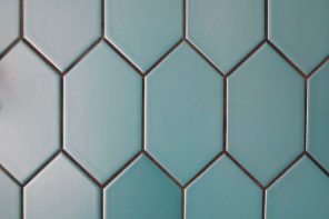
Once the layout was locked in, the next challenge was choosing tiles and finishes that had a colourful vintage vibe with a contemporary twist. I didn’t want anything too ‘on trend’ because I’m not planning on another bathroom renovation, EVER! I love colour and pattern, but the space is pretty small, so I didn’t want to overwhelm the room with too much going on.
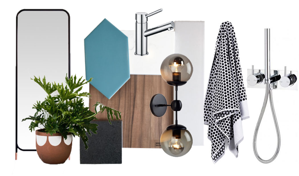
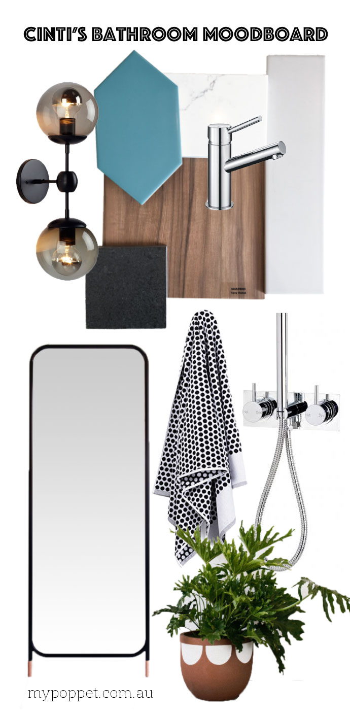
Pinterest was a great inspiration, and I’ve been collecting ideas for a couple of years on a bathroom board. The recurring theme on the board was a green/teal tile, so as soon as I saw our hexagon tile, I knew it was the one.
The other tile choices came together quickly after we picked the teal feature tile. The floor will be a dark stone look large ceramic tile, with enough texture through it to hide stray hairs and water splashes. The rest of the walls will be tiled in a soft grey narrow rectangular tile, arranged in a stacked pattern. All the wall tiles have a matte finish.
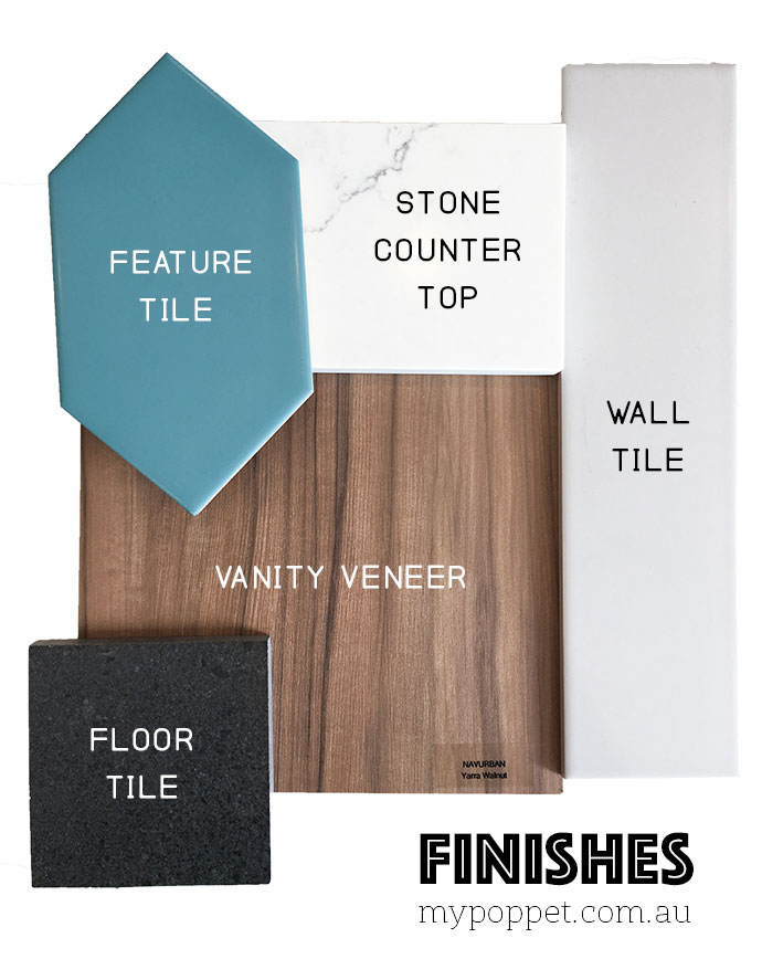
I chose grey instead of white because the red brick building next door casts a red glow into our bathroom. White tile would always look pink, and this grey seemed to clash less with the darker tiles in the rest of the room.
I’ve coloured in the elevations to give you a feel for the space.
Of course I intend to add some more colour and pattern with towels and some plants. I haven’t locked in the feature wall light choice yet, but I’m pretty partial to this one.
Down the track I’ll have a leaning full length mirror made to sit between the bath and the door on the wall opposite the toilet. I haven’t decided where the towels are going yet.
Here’s the overall look we are going for:
What do you think? Yay or Nay?
The joinery arrived today and is sitting in the garage. Hopefully It won’t be too long before I can share the reveal!
Catch up on the progress so far:
The new layout makes SO much more sense. It’ll be functional and feel right. I really like the pop of colour with your feature tile. It’s going to be beautiful!
Love that feature tile!!!!
I really love that tile! Where did you buy it from?
We bought them from Perini Tiles – I believe they are called gemstone. Here is the link. https://www.perini.com.au/index.html?Action=Commerce2.Product&ID=32322474 I can’t see the colour we used listed on the site.